EZ

OVERVIEW

A full rebrand for a PR and marketing agency built on one idea: good marketing shouldn't be complicated. Developed the brand story, verbal identity, and visual identity — including a flexible "house" system supporting multiple sub-brands (EZ·PR, EZ·Play, EZ·GoLive, EZ·Space, EZ·Health) under one cohesive identity, anchored by the tagline "Let's not make it hard."

YEAR

2026

ROLE

Brand Designer

SERVICES

Brand Story
Brand Design
Sub-brand architecture

About the project

EZ was founded on a simple observation: the PR and marketing industry had made itself unnecessarily complicated (jargon, vanity metrics, an obsession with follower counts over actual community influence.) The agency's whole thesis was that good marketing doesn't have to be hard. The brand needed to say that as clearly as the business model did. I led the full rebrand— brand story, verbal identity, visual identity, and sub-brand architecture—building EZ into a system that could hold multiple ventures under one coherent house.

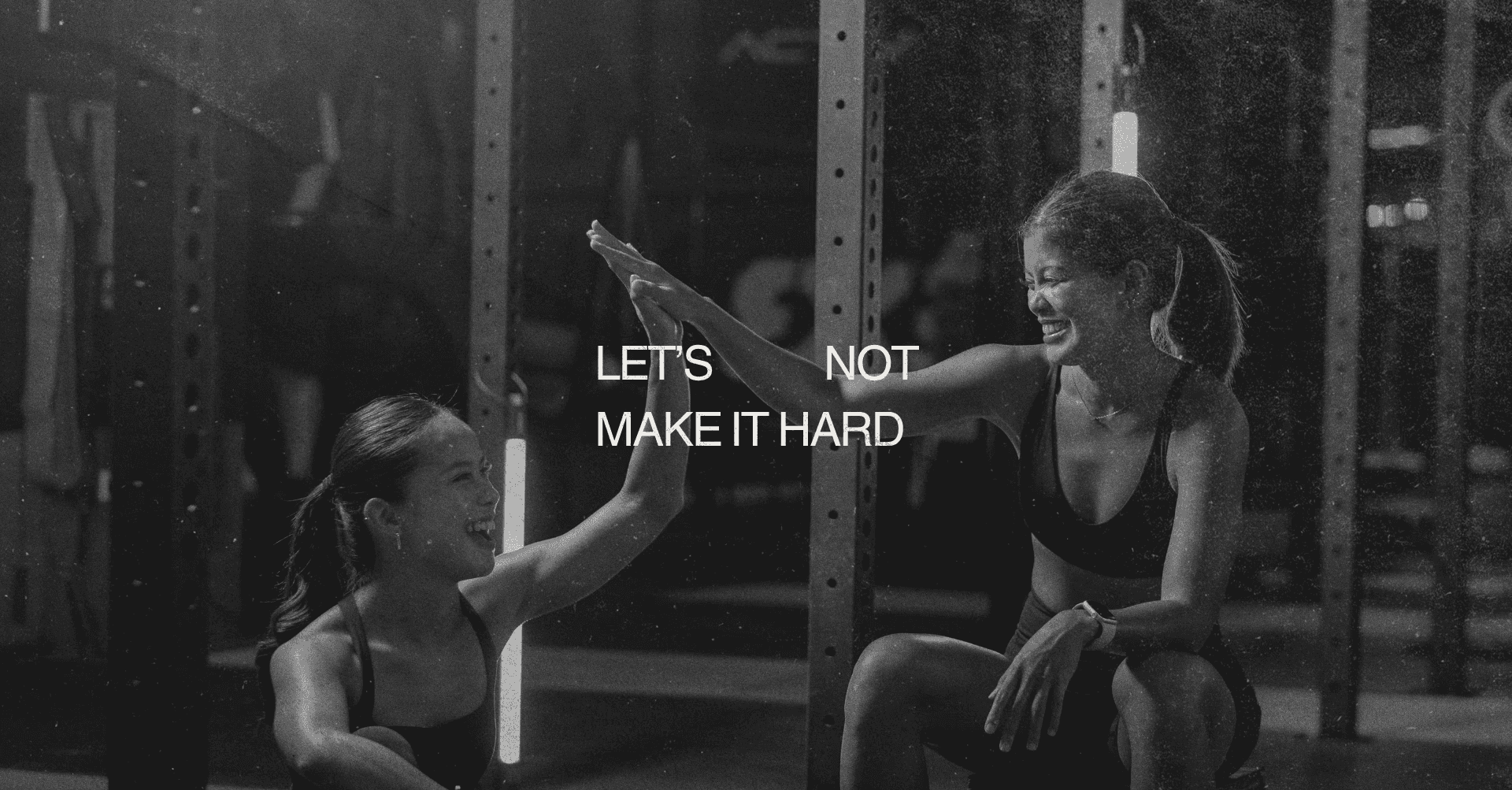
A tagline that's also the strategy. "Let's not make it hard" isn't just a nice line, it's the brand's entire operating philosophy, distilled. It shows up everywhere from the manifesto copy to merch, doing double duty as both message and mantra.

A name built for expansion, not just identity. EZ was designed from the start as "the house," a foundation that could support multiple sub-brands (EZ·PR, EZ·Play, EZ·GoLive, EZ·Space, EZ·Health) without diluting the core identity. Each sub-brand carries its own focus while staying visibly, unmistakably EZ.

A logomark that reads two ways. The EZ symbol works as a clean wordmark at a glance, but doubles as a graphic device flexible enough to anchor everything from business cards to stationery to trucker hats. Brand consistency that doesn't require a style guide to recognize.

Tone of voice that matches the promise. Direct, jargon-free copy throughout the brand book because a brand about making things easier loses credibility fast if its own voice doesn't practice what it sells.

A complete brand system, from founder narrative and brand story through full visual identity, color and typography systems, and applications across stationery and merchandise, built to scale as EZ's house of sub-brands grows.

EZ

OVERVIEW

A full rebrand for a PR and marketing agency built on one idea: good marketing shouldn't be complicated. Developed the brand story, verbal identity, and visual identity — including a flexible "house" system supporting multiple sub-brands (EZ·PR, EZ·Play, EZ·GoLive, EZ·Space, EZ·Health) under one cohesive identity, anchored by the tagline "Let's not make it hard."

YEAR

2026

ROLE

Brand Designer

SERVICES

Brand Story
Brand Design
Sub-brand architecture

About the project

EZ was founded on a simple observation: the PR and marketing industry had made itself unnecessarily complicated (jargon, vanity metrics, an obsession with follower counts over actual community influence.) The agency's whole thesis was that good marketing doesn't have to be hard. The brand needed to say that as clearly as the business model did. I led the full rebrand— brand story, verbal identity, visual identity, and sub-brand architecture—building EZ into a system that could hold multiple ventures under one coherent house.

A tagline that's also the strategy. "Let's not make it hard" isn't just a nice line, it's the brand's entire operating philosophy, distilled. It shows up everywhere from the manifesto copy to merch, doing double duty as both message and mantra.

A name built for expansion, not just identity. EZ was designed from the start as "the house," a foundation that could support multiple sub-brands (EZ·PR, EZ·Play, EZ·GoLive, EZ·Space, EZ·Health) without diluting the core identity. Each sub-brand carries its own focus while staying visibly, unmistakably EZ.

A logomark that reads two ways. The EZ symbol works as a clean wordmark at a glance, but doubles as a graphic device flexible enough to anchor everything from business cards to stationery to trucker hats. Brand consistency that doesn't require a style guide to recognize.

Tone of voice that matches the promise. Direct, jargon-free copy throughout the brand book because a brand about making things easier loses credibility fast if its own voice doesn't practice what it sells.

A complete brand system, from founder narrative and brand story through full visual identity, color and typography systems, and applications across stationery and merchandise, built to scale as EZ's house of sub-brands grows.

EZ

OVERVIEW

A full rebrand for a PR and marketing agency built on one idea: good marketing shouldn't be complicated. Developed the brand story, verbal identity, and visual identity — including a flexible "house" system supporting multiple sub-brands (EZ·PR, EZ·Play, EZ·GoLive, EZ·Space, EZ·Health) under one cohesive identity, anchored by the tagline "Let's not make it hard."

YEAR

2026

ROLE

Brand Designer

SERVICES

Brand Story
Brand Design
Sub-brand architecture

About the project

EZ was founded on a simple observation: the PR and marketing industry had made itself unnecessarily complicated (jargon, vanity metrics, an obsession with follower counts over actual community influence.) The agency's whole thesis was that good marketing doesn't have to be hard. The brand needed to say that as clearly as the business model did. I led the full rebrand— brand story, verbal identity, visual identity, and sub-brand architecture—building EZ into a system that could hold multiple ventures under one coherent house.

A tagline that's also the strategy. "Let's not make it hard" isn't just a nice line, it's the brand's entire operating philosophy, distilled. It shows up everywhere from the manifesto copy to merch, doing double duty as both message and mantra.

A name built for expansion, not just identity. EZ was designed from the start as "the house," a foundation that could support multiple sub-brands (EZ·PR, EZ·Play, EZ·GoLive, EZ·Space, EZ·Health) without diluting the core identity. Each sub-brand carries its own focus while staying visibly, unmistakably EZ.

A logomark that reads two ways. The EZ symbol works as a clean wordmark at a glance, but doubles as a graphic device flexible enough to anchor everything from business cards to stationery to trucker hats. Brand consistency that doesn't require a style guide to recognize.

Tone of voice that matches the promise. Direct, jargon-free copy throughout the brand book because a brand about making things easier loses credibility fast if its own voice doesn't practice what it sells.

A complete brand system, from founder narrative and brand story through full visual identity, color and typography systems, and applications across stationery and merchandise, built to scale as EZ's house of sub-brands grows.